Why your website can't be an online brochure
Way too many business owners think they can get away with using the content of their brochures to...
When thinking about your website's effectiveness, keep one crucial mantra in mind:
My website exists solely to solve my customers’ problems.
Too many businesses focus on talking about themselves and their brand. Instead, they need to be solving their customers’ problems. Seriously. When people visit a website, they have a problem and need it solved.
With that in mind, here are six ways your website is sending your customers elsewhere.
When a customer visits your website, they should be able to intuitively understand where to go next. If they are confused and not sure what to do, they will leave and maybe even go to your competitor’s site. Before a web visitor can buy your product/service, they need to be able to navigate your website easily. Help them out by including a clear call to action and funnel them to the specific page where they can take action to have their needs met.
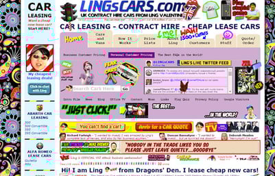
Whitespace is your friend. Please don’t fill up your web pages with images, videos, text, etc. Keep it simple. Visitors to your site will appreciate it. Below is a particuarly egregious example.
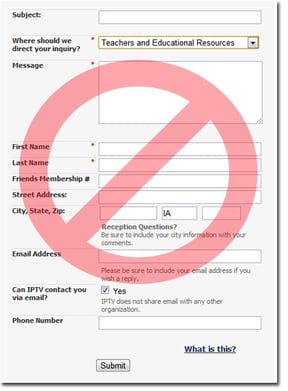
When you ask website visitors for their information in a form, you better be giving them something in return. It’s a give and take relationship. They are offering up their personal information, so you better deliver with something, whether it’s a free consultation, an e-book, or a customized quote. Don’t ask for too much information. This will scare people away. If someone needs to provide their home address and their annual salary to contact you, they’ll leave. It’s that simple. Make sure the amount of info you ask for mirrors the value of your offer.
If your goal is to increase traffic to your site and, in turn, increase business, flash is not for you. Flash pages are not indexed by search engines, they use more bandwidth, they do not work on mobile phones, and they restrict usability. On top of all that, Flash Player vulnerabilities can introduce the possiblity of real security threats to your private information. There's even a popular movement to rid the world of the flash player plugin. In 2015, your company website should not use flash. Period.
Speaking of being up to date, having a mobile responsive site is absolutely critical to success today. This year, Google announced that more people are searching the web on mobile devices than on desktop computers. If your site is not mobile responsive, visitors will be forced to do the dreaded pinch and pull gestures to zoom in and out, and they will leave.
Studies have shown that if a website does not load within three seconds, 57% of visitors will abandon the site. Make sure that you don’t have excessively large images and videos slowing down your site. Also, use a reliable web host. People subconsciously judge sites based on page load times, and it affects Google search rank as well.
So there you have it. Avoid these six mistakes to make sure customers stay on your site and purchase your product or service. Need help with any of these? Drop us a line, we’ll let you know if we can help.

Way too many business owners think they can get away with using the content of their brochures to...
Shannon Register found us from a Google Search! That's just awesome! Great SEO work I must say......